#0211CLICK HERE TO BUY JUNCTURE •
INTRODUCING
JUNCTURE
AN INDUSTRIAL SUPERFAMILY
By Lettermatic
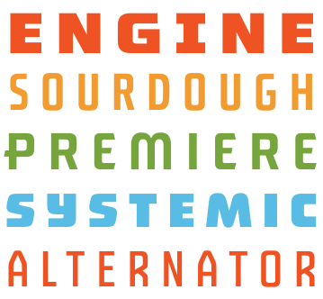
Cutout 1
VARIABLE WEIGHTS
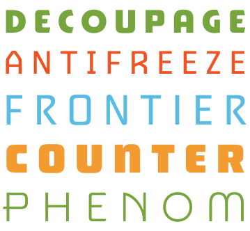
Cutout 2
4 DISTINCT STYLES
Cutout 3
VARIABLE WIDTHS
Cutout 4
LANGUAGE SUPPORT
Wide Cutout
WITH ALTERNATE CHARACTERS AND UNIQUE FIGURE SETS
ITS ALL IN THE BOX!
LETTERMATIC OFFERS NO-FUSS LICENSING.
GET ALL 4 TYPEFACES, WEIGHTS, AND WIDTHS WITH ONE EASY PURCHASE.
EXPLORE THE WORLD OFJUNCTURE
DELI
ABCDEFGHIJKLM
NOPQRSTUVWXYZ
REBAR
ABCDEFGHIJKLM
NOPQRSTUVWXYZ
DECO
ABCDEFGHIJKLM
NOPQRSTUVWXYZ
ASTRO
ABCDEFGHIJKLM
NOPQRSTUVWXYZ
WEIGHT638
WIDTH500
JUNCTURE
DELI

Deli takes cues from letters found behind the counter of soda shops and diners, and on vintage neon signs. Its overall personality is approachable, friendly, and extremely functional.

ABCDEFGHIJKLM
NOPQRSTUVWXYZ
1234567890&!?
WEIGHT638
WIDTH500
JUNCTURE
REBAR

Rebar's letterforms feel like they could have been bent out of pure steel. Reminiscent of letters found in auto shops, factories, and general stores, these letters feel sturdy, structured, and highly utilitarian.

ABCDEFGHIJKLM
NOPQRSTUVWXYZ
1234567890&!?
WEIGHT638
WIDTH500
JUNCTURE
ASTRO

Astro nods to the futuristic sci-fi fantasies that were catalysts of discovery and possibility during the industrial era. Its letterforms are more rounded, streamlined, and elicit a sense of wonder and awe.

ABCDEFGHIJKLM
NOPQRSTUVWXYZ
1234567890&!?
WEIGHT638
WIDTH500
JUNCTURE
DECO

Deco borrows quirks from its namesake art movement with more drastic curves, angled terminations, and extended crossbars for a touch of the avant-garde. The overall character evokes a sense playfulness, while still feeling refined. The extended crossbars can be turned off for a sleek alternative look.

ABCDEFGHIJKLM
NOPQRSTUVWXYZ
1234567890&!?
WEIGHT638
WIDTH500

MADE FOR DESIGNERS WHO CARE

Many designers have a collection of several industrial-style fonts in their toolkit that they come back to project after project. You needed a bunch of them because one might be too bold, another might have a weird A drawing, and a different one might be too wide. Juncture was made to be the one powerhouse industrial typeface package designers reach for again and again. This superfamily explores the industrial genre as a range of related styles, instead of a single fixed style. Designed to capture the spectrum of industrial letterforms, it includes four unique typefaces that each bring something different to the table, as well as a full range of weight and widths.

On their own, each typeface sets a tone, from classic and bold to sleek and futuristic, but the real fun begins when you start combining them. Mixing styles within a single composition lets you shape hierarchy, create contrast, or simply inject a bit of unexpected personality. Pair Rebars heft with Astros precision, or let Delis warmth play against Decos formality. The system rewards experimentation. Its a modular approach to display type that invites rhythm, tension, and balance giving you a dynamic typographic toolkit that can evolve with the needs of your layout, and journey with you from project to project.
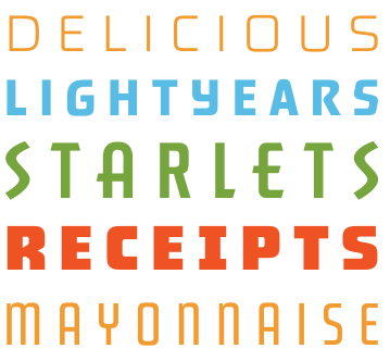
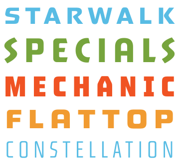
Juncture color waterfall specimen

TRY JUNCTURE

SIZE84pt
WIDTH350
WEIGHT638
TYPE SOMETHING...

VARIABILITY

Juncture offers remarkable and dynamism. From the beginning, Lettermatic set out to challenge what an industrial type system could be, sketching dozens of potential styles in order to capture the full range of tone, structure, and personality. As designers ourselves, we wanted to create something with the versatility to be used again and again, project after project.

What emerged is a family thats tightly woven yet distinctly varied — a family of four typefaces that feels cohesive, flexible, and expressive. Its a modular system of typefaces that functions both independently and as a collective. With variable fonts and plenty of customizable OpenType features, users can easily shift weights and widths on the fly, making nuanced design decisions in real time.

COMPARE CHARACTERS

OBSERVE THE UNIQUE CHARACTERISTICS OF EACH TYPEFACE

DELIPRODUCTION MANUALS
REBARPRODUCTION MANUALS
ASTROPRODUCTION MANUALS
DECOPRODUCTION MANUALS
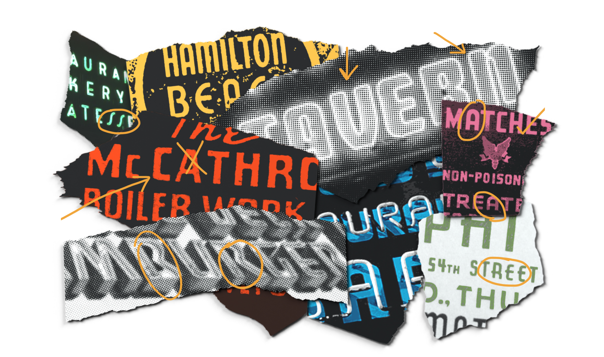
Juncture hero collage

YOUVE SEEN THESE LETTERS EVERYWHERE

In the mid-19th century, sans-serif letterforms emerged as the Industrial Revolution propelled culture toward radical modernization and mechanization. At first, these new characters were met with skepticism. Their stark, serif-less appearance was unfamiliar and even unsettling to readers accustomed to more traditional type. They were dubbed grotesque due to their perceived awkwardness, but it didnt take long for their merit to become evident. The straight sides characteristic of this genre allowed for bold, brick-like headlines, and their high legibility made them a natural choice for advertising clear, punchy, and impossible to ignore.

Their straightforward constructions made them easy to reproduce, which quickly endeared them to sign painters and craftspeople across many industries. With manufacturing on the rise and consumer goods flooding the market, these typefaces fit perfectly into the bold, fast-moving landscape of industrialized print and advertising culture. These new letters also carried a spirit of accessibility, in that they were less fussy to construct than serif letterforms. Juncture reflects Lettermatics appreciation for the utilitarian precision and understated beauty of industrial-era typography. We hope you enjoy using it as much as we enjoyed making it.

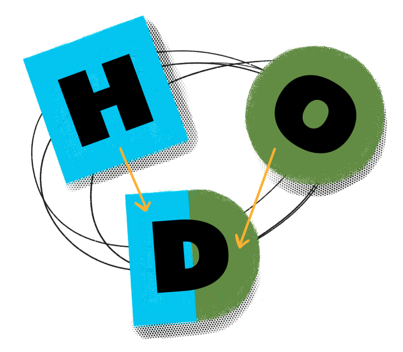
OHD diagram

SIMPLE CONSTRUCTIONS

Juncture pays homage to this industrial lineage across all four of its unique styles. At its foundation are simple geometric shapes — squares, circles, and triangles, combined in various ways to create distinctive letterforms. This shared framework keeps the styles visually connected, while allowing each one to stand on its own. The result is a versatile system with a unified core.

EMPHASIS & LEGIBILITY

Because industrial typefaces are typically used for headlines and shorter phrases, and not dense blocks of text, they tend to shine in uppercase. Juncture leans into that display strength, offering variability in weight, width, and style for a powerful typographic presence.

temp footer